Ways To Optimize Your Donation Page For Conversions
A compelling cause, amazing email open and click-through rates, tons of website traffic — none of these things make a difference if your donation page doesn’t convert. The good news is that if someone has made it to your donation page, you’ve done a good job communicating the importance of your cause and capturing their interest. Because this last step requires their money and personal information, it’s no surprise this is where most people drop off, but think of the benefits to your organization if you could improve your donation conversion by just a small percentage.
Here are six ways you can create a better experience for your donors and a more effective donation page.
Be clear about what their donation will do.
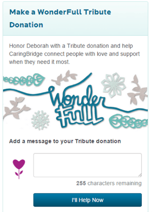
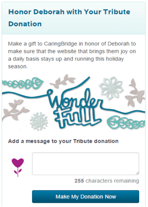
When it comes to donating, people want to know the ‘why’ so telling them how their donation will help is essential in converting them. Try your best to keep your message concise, but don’t sacrifice the quality of content just to keep your message under a certain word count. If your message is longer, use white space and break your copy up into smaller paragraphs to make it more readable. The donation page below saw a 86% increase in conversions simply from clarifying the value of what the donation actually does.


When crafting your donation page copy, asking yourself the following questions can be helpful:
- Is any of the content confusing?
- Does any of the content raise doubts?
- Can anything be removed while still maintaining the most important messages?
Don’t just offer recurring donations. Give a reason for recurring donations.
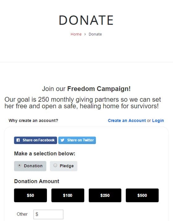
Recurring giving is crucial to financial forecasting and long term sustainability for fundraising. In fact, studies have found that retention rates rise from 45% to between 80-85% when a recurring gift is secured. If you offer an easy way to make a recurring donation then you’re on the right track, but increasing the likelihood that visitors act on this option means demonstrating the value it adds. This could be anything from providing a list of monthly donation amounts each tied to a concrete impact or the invitation to be part of a larger giving community. If you feel communicating this value adds an overwhelming amount of information to your donation page, instead make sure your emails or website pages outline the impact of recurring donations.
Build on your message don’t repeat it
Someone who is visiting your donation page is there because they’re interested in the information you’ve already provided to them about your cause. Keep in mind, that they still need to be convinced, so rephrasing what they already know will not be as effective as sharing new information that makes the original message more compelling. Try using quotes or stats to further motivate the potential donor.
Remove anything that distracts from the donation process
Have you ever started a task, only to be deterred by a bunch of distractions that prevent you from completing it? Your donation page functions in a similar way; the more options, links, and navigation elements that divert attention away from completing the donation, the more people will leave without donating. Here are some ways to streamline your donation page:
- Remove any calls to action that don’t help the donor finish making a donation.
- Remove any links that direct the donor away from the page.
- Consider making any account registration or login a post-donation experience.
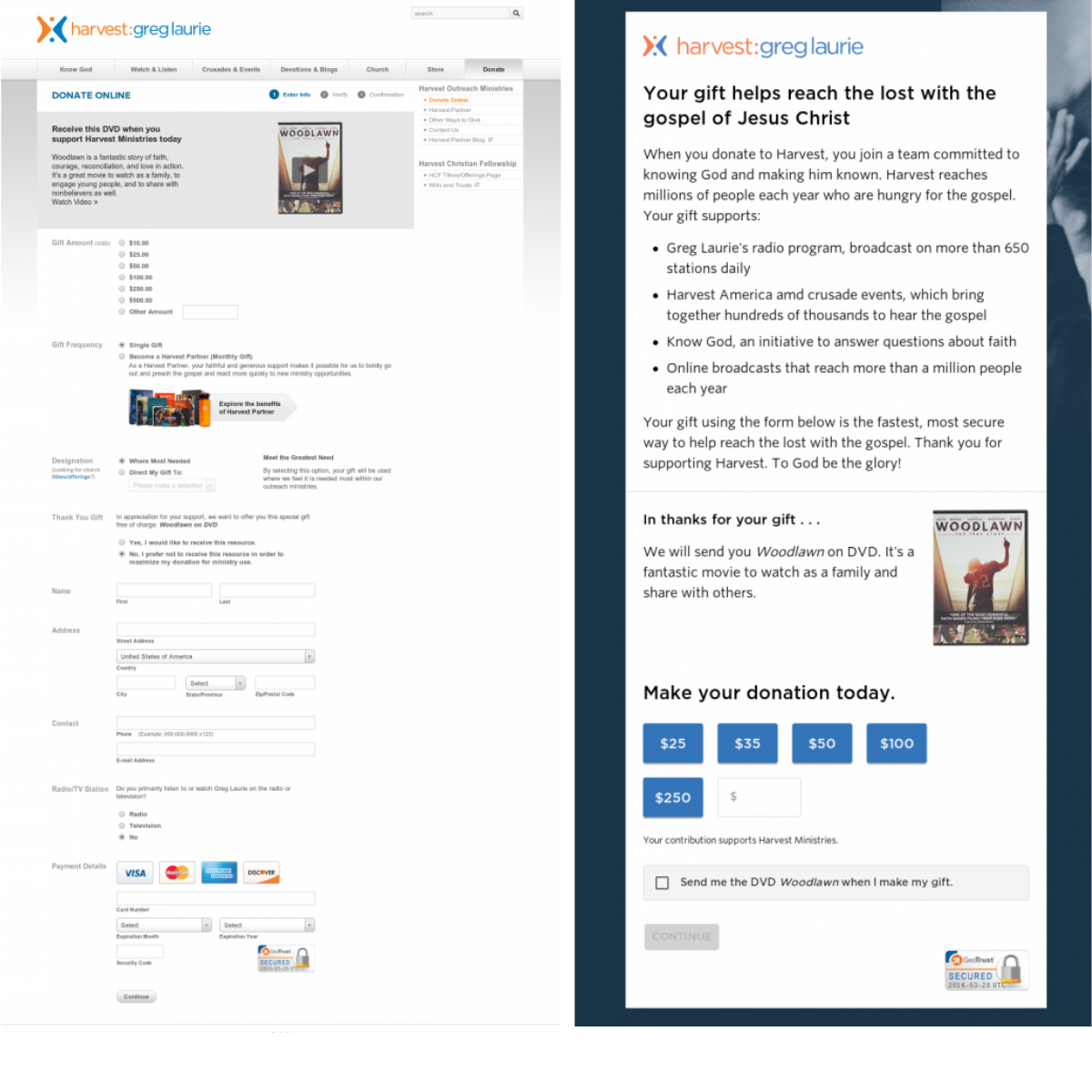
By simplifying their landing page, Harvest Ministries was able to increase their conversion rate by 44%.
Create a separate donation page for different fundraising campaigns
Whether you're running your campaigns through social media, email or any other means, giving each campaign it’s own donation page will make it easier for you to execute the optimizations we’ve discussed so far. For instance, if you're running a campaign to provide clean drinking water for a community and another campaign to renovate a classroom, separate pages will allow you to provide messaging unique to each cause.
Set a goal with a desired end result
Setting a goal shows the potential donor what is required to achieve the impact your cause is spearheading. It can also provide insight into how much progress has been made and how much progress still needs to be made, which can be very motivating to donors. Don’t just make your goal an arbitrary number, instead tie it to a specific qualitative and quantitative outcome, such as how many people you’ll be able to help or what you’ll be able to provide for them.

Think critically about the length of your donation form
Put yourself in the donor's shoes. You’re already asking them for their money, so asking for a plethora of personal information isn’t going to help your cause. Thinking about these questions can help improve your donation form:
- Are you asking for too much information?
- Is the visual length of the form daunting?
- How long does it take to fill out the form?
- Is all the information necessary or can some fields be removed for a better experience?
As long as you capture their email address and can easily access email lists through your donor management system, you can always follow up with communications geared at getting to know your donors better.
We hope these tips help you optimize your donation page! If you’re interested in driving more traffic to your donation pages, check out these fundraising email tips or discover trends in donor behaviour to help inform your fundraising strategy.
>>>> Watch a demo <<<<
>>>> Sign up <<<<

